
Brandassets
Our logo in every form we use it, with our colours and type. You’re welcome to use them to write about us, list us, or show work we made together.
35 files, updated 9 October 2026

HIBISCUSTHEORY
Logo
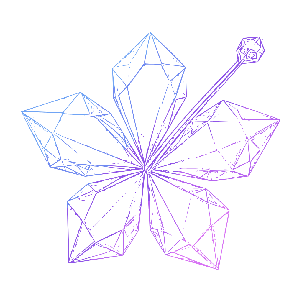
The crystal hibiscus is the mark. Set beside our name it makes the lockup, which is the version to reach for first. Where full colour can’t go, use the line versions.
Mark
The hibiscus on its own, for avatars and anywhere our name is already nearby. It’s painted artwork, so it comes as PNG only.
Stacked lockup
For square spaces: posters, merchandise, a profile banner.


Horizontal lockup
Our primary logo. The mark and the name, as they sit at the top of our site. Use it unless you have a reason not to.

One-colour lockup
Fully vector, in a single flat colour. For one-colour print, a sponsor wall, anywhere the crystal can’t be reproduced.
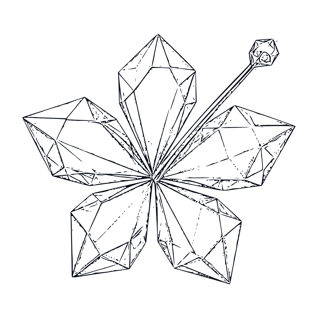
Line mark
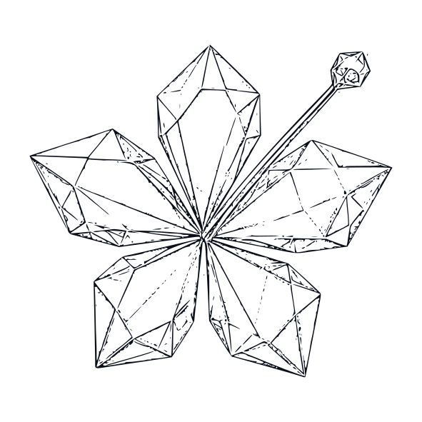
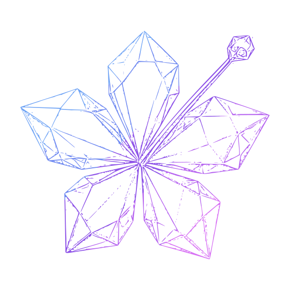
The wireframe the crystal is cut from. Our loading screen draws it. Vector, so it holds at any size.






Wordmark
Our name in Anton, as outlines, so it renders the same whether or not the font is installed.
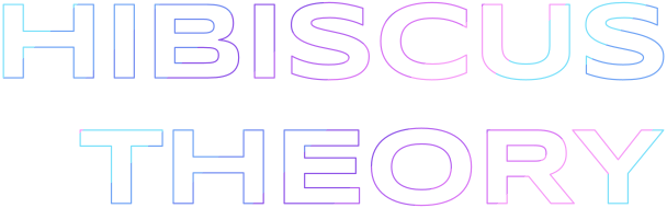
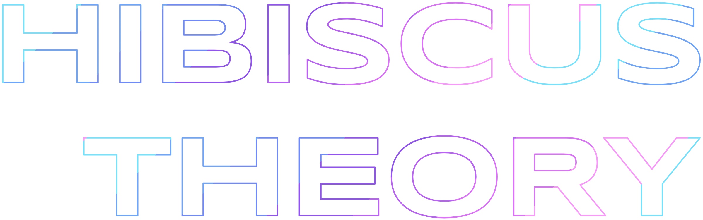

Display wordmark
The title-card treatment from our home page. A hairline outline, so only at large sizes on dark backgrounds: a stage screen, a poster, a cover.

App icon
The mark on void, square-cornered. Each platform applies its own rounding.


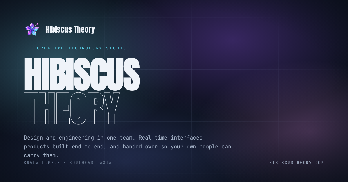
Link preview
The card that appears when our site is shared. 1200 × 630.
Using it
Use the files as they come. If something here doesn’t fit what you’re making, write to us and we’ll make you a version that does.
You’re welcome to
- Use our logo to refer to us in press, articles and talks.
- Show it on a client, partner or sponsor page.
- Credit us on work we made together, or in a case study.
- List us at an event, on a directory, or in a deck.
Please don’t
- Suggest we endorse or sponsor something we don’t.
- Make it part of your own logo, product or brand.
- Make it the most prominent thing on your page or product.
- Change it. The section below shows the usual ways people do.
xx
Clear space
Keep a margin around the logo at least x wide, where x is the height of the H in our name. Nothing else goes inside it: no text, no edge, no other logo.
30 mm in print

8 mm
Minimum size
Below these the name stops being readable and the crystal turns to a smudge. Shown here at actual size.
Don’t stretch or squash it.
Don’t rotate it.
Don’t recolour the crystal.
Don’t add shadows, glows or outlines.
Don’t place it where it can’t be read.
Hibiscus TheoryDon’t reset our name in another typeface.
Colour
A dark ground, light type, and the hibiscus’s own spectrum for the moments that should glow. Select any value to copy it.
Sampled from the crystal, in order, cyan to magenta. On the title card they run as hard-edged diagonal bands through the outline of our name; in a fill they may blend.
Core
Mostly void, with type in ink. The greys carry everything that should read second.
Void
The ground. Most of every surface, on screen and in print.
- Hex
- RGB
- 10 15 26
Ink
Type, and the reversed logo.
- Hex
- RGB
- 239 243 249
Dim
Supporting copy and captions.
- Hex
- RGB
- 163 177 198
Dimmer
Labels and metadata. Too faint for body text.
- Hex
- RGB
- 108 123 146
Line
Hairlines, borders and grids. Ink-blue at 17% over void.
- Hex
- RGB
- 38 46 63
- CSS
- rgba(175, 200, 245, .17)
Accents
Used in small amounts. Cyan is the only one that ever means something.
Cyan
Interaction: hover, focus, progress, anything live.
- Hex
- RGB
- 99 232 255
Amber
Step numbers and small counts.
- Hex
- RGB
- 255 190 114
Violet
Glow and light in imagery.
- Hex
- RGB
- 169 140 255
Coral
Warnings, and glow in imagery.
- Hex
- RGB
- 255 111 142
The whole palette, for your design tool or your code.
Type
Four families, all free on Google Fonts. Anton does the talking, JetBrains Mono does the explaining, and the other two appear once a page at most.
Hibiscus Theory
ABCDEFGHIJKLMNOPQRSTUVWXYZ abcdefghijklmnopqrstuvwxyz 0123456789
A flat mockup cannot tell you whether a trading screen feels fast, or whether opening a card pack feels fair. Those answers only exist in something you can actually use. So that is what we build first.
0123456789 {} [] => != &&
Only in motion.
Written so it can still be changed a year later, by someone who was not there when it was made.
Hibiscus Theory
Wide and even in stroke, which is what lets the spectrum run through its outline.
Our name
What to call us, and the words to use if you need to say who we are.
Writing it
- Hibiscus TheoryTwo words, both capitalised. Every time.
- hibiscustheoryOnly in our web address, email and handles.
- Hibiscus theoryThe second word is capitalised too.
- HibiscusTheoryTwo words, with a space.
- HTPlease don’t shorten it in public.
Describing us
In a few words
Hibiscus Theory is a creative technology studio in Kuala Lumpur.
In a paragraph
Hibiscus Theory is a creative technology studio in Kuala Lumpur. Design and engineering work as one team, building real-time interfaces and complete products end to end, then handing them over so clients’ own people can carry them.
- Founded
- 2024
- Based in
- Kuala Lumpur, Malaysia
- Web
- hibiscustheory.com
- hello@hibiscustheory.com